Visual power in the AI era: three basic skills to make images visible at a glance
In the past few years, when we talk about AI, content production, personal branding or newsletter design, we often focus on tools.
Which set of AI drawing tools to use? Which presentation template to use? Which photo editing software do you use? Which set of prompts can be used to generate beautiful images?
But I feel more and more that the key to whether a picture, a page of briefings, or a social picture card can be seen and remembered is often not the tool, but the underlying visual judgment.
The so-called visual judgment does not mean that you must become a photographer, designer or artist, but that you must know: Why is a picture comfortable? Why the confusion? Why do some photos look so high-end? Why do some posters contain a lot of information but are easy to understand at a glance? And why do some AI-generated pictures look full of details, but people don’t know where to look?
I would like to break this matter down into three most basic and practical principles:
First, remove the clutter.
Second, reserve space.
Third, establish a single focus.
These three principles, seemingly simple, are the starting point for all visual communication. Whether you are taking photos, making presentations, designing course posters or producing social posts, or even writing AI drawing prompts, as long as you master these three things, the quality of the picture will have the opportunity to improve to a higher level.
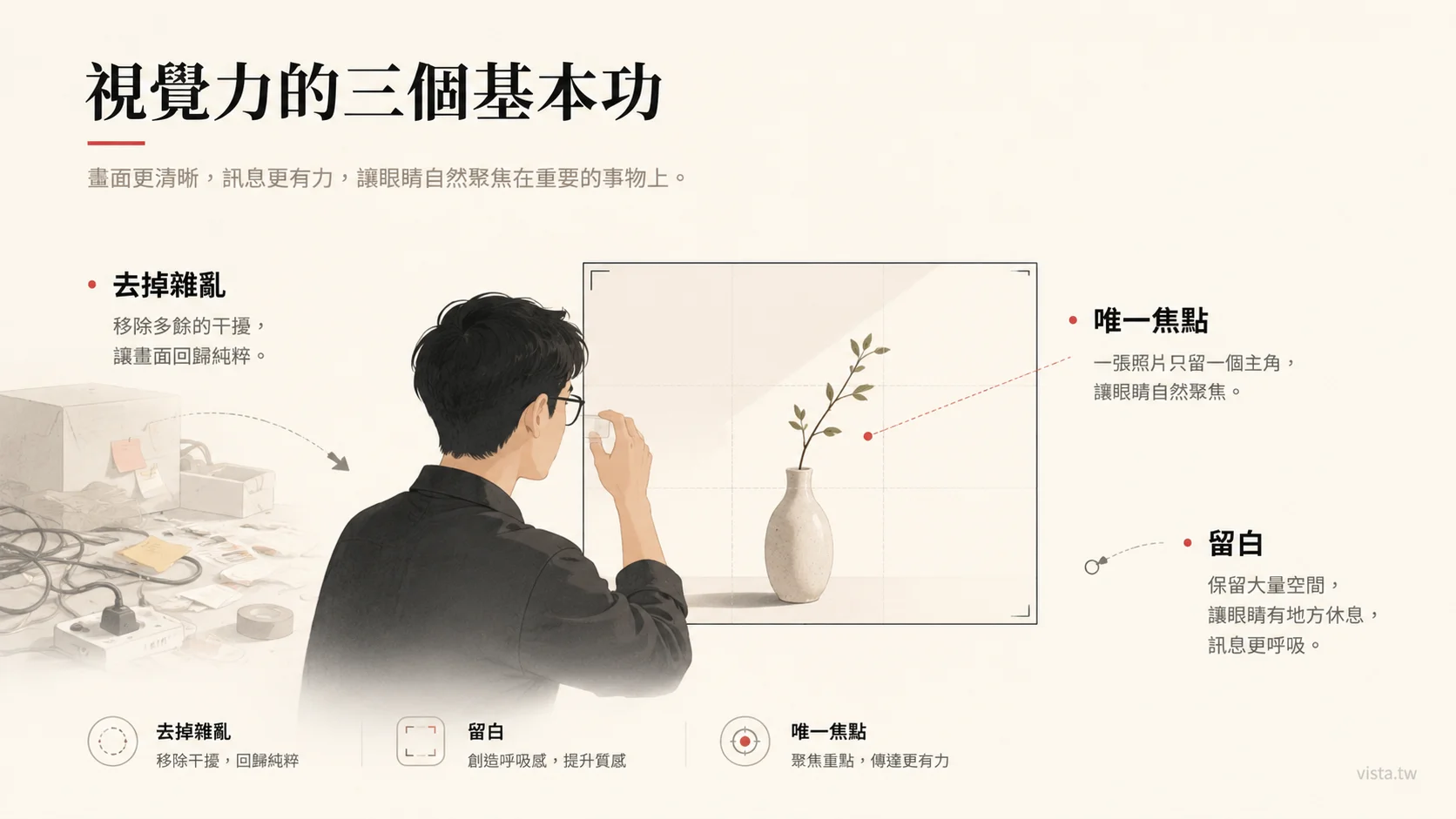
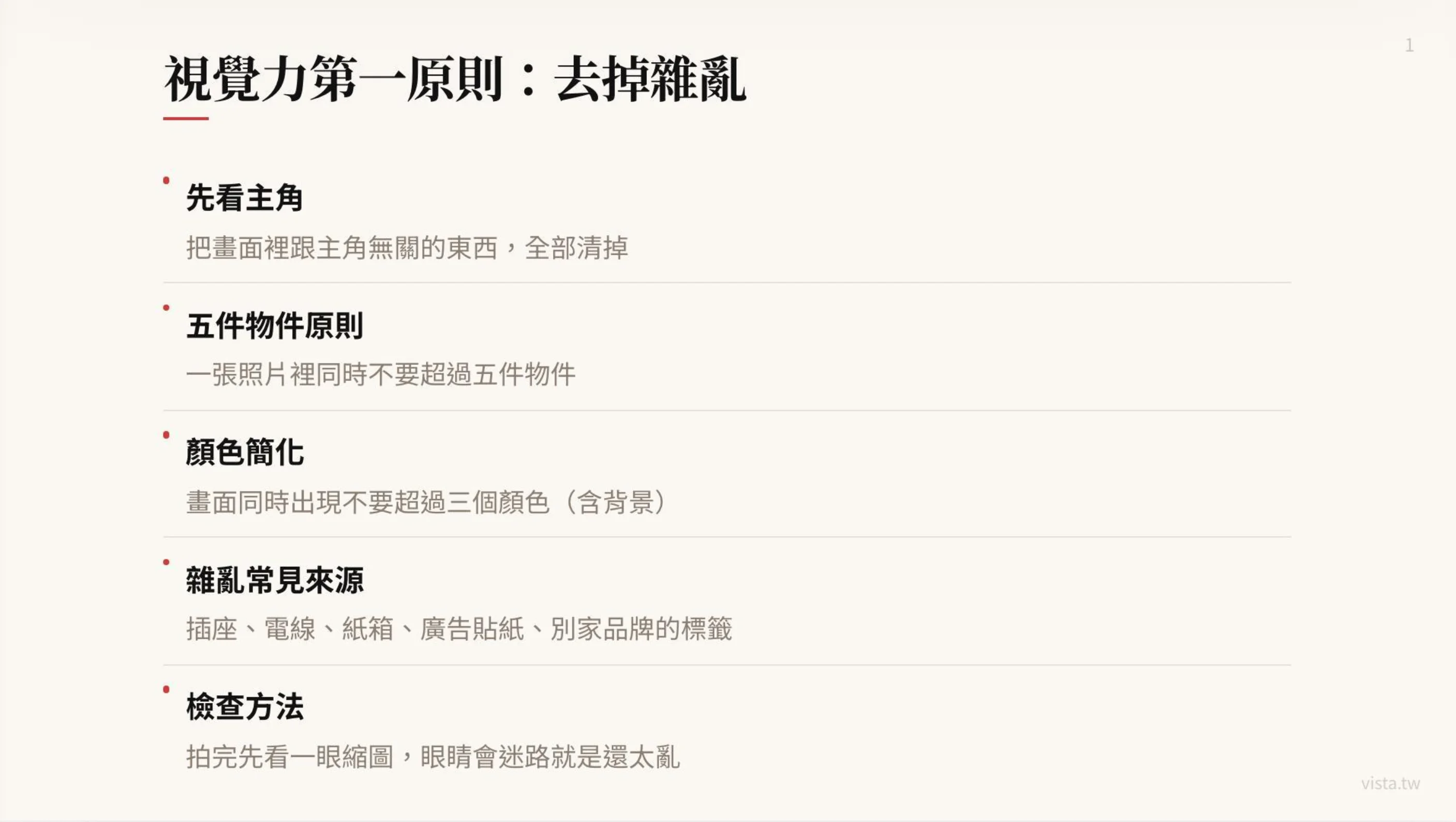
1. The first principle of vision: remove clutter
Many people think that a good-looking photo is because it has something extra.
Well, a little more props, a little more color, a little more decoration, a little more light and shadow or a little more design.
However, the opposite is often true.
A truly powerful photo is usually not because it has a lot of stuff in it, but because it takes away the unnecessary stuff.
This is also the first basic skill of vision: look at the main character first, and then clear out all the things in the picture that have nothing to do with the main character.
The reason why many photos are not good-looking is not because the protagonist is not good-looking, nor is the camera bad, but because the picture is too noisy. There are sockets, wires, cartons, advertising stickers or other brand labels in the background; there are unused cups, bags, and sundries on the table; there are unnecessary patterns on the walls; there are half passers-by, half chairs, or a bunch of meaningless lines stuck in the corners of the picture.
These things don’t necessarily stand out, but they can stealthily consume the viewer’s attention.
The human eye is actually very sensitive when looking at pictures. Whenever there are too many irrelevant elements in the picture, the brain starts to get distracted. I was supposed to look at the protagonist, but my eyes were sucked away by the wires next to me. I was supposed to feel the emotions of the characters, but the signature text in the background was too eye-catching. I wanted to show a sense of high-end, but the pile of clutter on the table turned the picture into a life record photo.
Therefore, before taking pictures, we have to do a very simple but important thing: clear the place.
The clearing here is not only physical tidying up, but also visual choices.
Here are five questions you can ask yourself:
- Who is the most important person or thing in the picture?
- Does anything else help the protagonist?
- Is there anything that might steal the protagonist’s attention?
- Are there too many colors?
- Are the corners too messy?
I like a simple rule: no more than five objects in a photo at the same time.
This is not an absolute rule, but a good way to help beginners control their graphics. Especially when taking product photos, character photos, course promotion photos or lecturer image photos, the more things there are, the easier it is to look messy. You think that adding a few more items can increase the sense of life, but many times, that just adds to the burden.
The same goes for colors.
Too many colors appearing in a picture at the same time will make the picture lose its sense of unity. A safer approach is to use no more than three main colors in the image at the same time, including the background.
For example, if you want to take a photo of a lecturer’s desktop work, you can make the main color an off-white background, the second color a dark laptop, and the third color the warm tones of a coffee cup or notebook. This way the picture will be clean, layered and less likely to be cluttered.
On the other hand, if there is a red package, a blue folder, a green sticky note, a black mouse, a silver laptop or a yellow coffee cup on the table, plus a bunch of posters in the background, the picture will immediately get out of control.
This thing totally applies to AI drawing as well.
Many people are writing AI drawing prompts and can’t help but put everything they want into it: cafes, laptops, books, window views, plants, cats, neon lights, bookshelves, people, city night scenes, handwritten notes, starry skies, retro lampstands, etc. The resulting image looks rich, but hard to focus.
AI is very good at adding things out of thin air, but it is not very good at automatically helping you determine which things should be deleted?
So, a good prompt not only tells the AI what it wants, but also tells it what it doesn’t want?
For example, you can write:
Keep the screen clean. The main character is a lecturer working in front of a laptop. Only the laptop, a notebook and a cup of coffee are kept on the desktop. No unnecessary clutter, no background signs, no complicated decorations, and no more than three overall colors.
The pictures produced in this way are usually more stable than “please draw a high-quality work scene”.
Because you are not just asking for beauty, but you are helping the AI establish visual order.
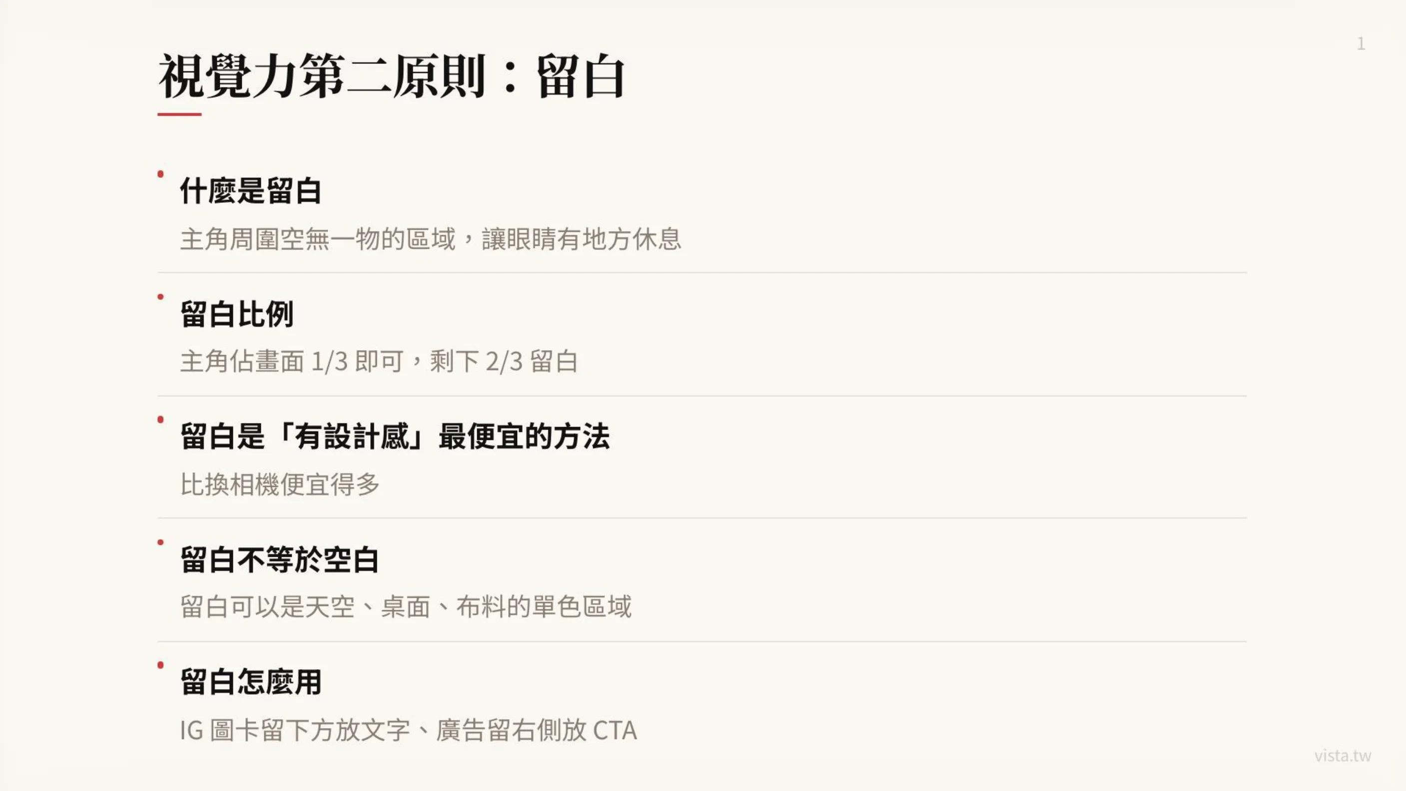
2. The second principle of visual power: blank space
When many people hear white space, they think it is just a matter of aesthetics in design.
Not really.
White space is not blank. White space gives the eyes a place to rest, allows the protagonist to be seen, and gives the message room to breathe.
In the picture, the empty area around the protagonist can be called blank space. It can be the sky, a wall, a tabletop, or a piece of monochromatic fabric. The point isn’t that there’s really nothing there, but that it doesn’t visually steal the show.
The most common mistake many beginners make when designing is to be afraid of empty space.
I had some free space on the right side of the poster, so I wanted to insert an icon. There is space at the bottom of the presentation and I just want to add a line of text. The background of the photo is too clean, so I just want to add some decoration. There is too much white space in the social picture card, and it feels like there is no design.
But masters are just the opposite.
Masters know that the picture is not complete only if it is full, but rather allows the important things to have a stage.
If the main character occupies one-third of the frame and the remaining two-thirds are left blank, the photo may actually have more quality. Because the viewer’s eyes are not forced to run around in the picture, but naturally stop on the protagonist.
White space is also the cheapest design sense available.
Many people think that design comes from expensive equipment, complex layout, special fonts or high-end filters. But in practice, leaving blank space is often the easiest, lowest cost, and most effective way to do it.
This is cheaper than replacing a camera, cheaper than buying templates and templates, and cheaper than hiring a designer to redo it ten times. It may even be more effective than spending three hours mixing colors.
As long as you remove the unnecessary things next to the protagonist, the picture will become more advanced.
For example, when taking an Instagram picture card, if the main character is in the center of the picture and there is a clear area below, you can put the title text. When shooting advertising materials, if the character is placed on the left and a clean area is left on the right, you can place the CTA. When making the main visual of a course, if the lecturer’s photo fills the entire picture, it will be difficult to arrange the text; but if the characters only occupy one-third, and the remaining space is for the course name, date, selling points, and registration button, the entire picture will be much clearer.
Therefore, white space is not just for aesthetics, but for business communication.
It gives a place for text, a place for CTA to appear, and a way for the brand message to not fight with the background.
This is especially important in AI drawing prompts. Because AI presets love to fill the screen. If you don’t specifically request it, it will often automatically add gorgeous backgrounds, complex lights and shadows, full-page decorations, and too many objects.
You can add such restrictions to Prompt:
The protagonist is located in the left third of the screen, leaving a clean white space on the right side. The background is a soft monochrome wall to facilitate subsequent placement of title text and CTA.
Or:
Please keep a large area of the desktop clean at the bottom of the screen without placing clutter as a text layout area.
In this way, the pictures you ask AI to generate will not only look good, but also be usable.
Well, there’s a big difference here.
Many AI pictures look beautiful at first glance, but they cannot be used as posters because there is no white space. They look like works, but not like source material. For pictures that are truly commercially usable, layout space must first be considered, rather than just pursuing rich details.
So before you take a photo or generate a picture, you should first ask yourself: What will this picture be used for later?
- If it’s just a commemorative photo, it can be a little fuller.
- If you want to make a presentation cover, you need a title area.
- If you want to create creatives, you need a CTA area.
- If you want to make a social picture card, you need a clean text-bearing area.
- If you want to create a course enrollment page, you need to let people see the protagonist, title and action information at a glance.
Blank space is not a waste of images, but a space reserved for communication.
3. The third principle of visual power: sole focus

A photo can only have one protagonist.
This sentence seems simple, but it is almost the most overlooked principle of all visual design.
Many photos are not good-looking, not because there is no focus, but because there is too much focus. There are two people, three products, four slogans, and five buttons in the picture. Each one wants to be seen, but the final result is that none of them are actually seen.
The biggest fear in visual communication is not the lack of information, but the competition between information.
When there are two equally important protagonists in a picture, the eyes hesitate. When the background is also clear, the foreground is also clear, there are many words, and the colors are bright, the viewer does not know where to look first.
So the third principle is: establish a single focus.
The focus can be in the center or at the intersection of the third lines. Both of these are very safe ways to compose images.
If you want the image to be stable, formal, and direct, place the main character in the center. This is suitable for portrait photos, product key visuals, and course instructor photos.
If you want to make the picture more narrative and spatial, you can place the protagonist at the third line. This is suitable for travel photos, lifestyle photos or brand story photos, as well as commercial images that require space for text.
But no matter where the protagonist is placed, the key point is: the protagonist must be significantly larger than other objects.
Size can be said to be the most direct visual hierarchy. If the protagonist is too small, the eye will not recognize it as the protagonist. Especially when browsing on mobile phones, the picture will be reduced very small. If the main character is not big enough and clear enough, the entire picture will lose its recognition.
This is why community thumbnails, YouTube covers, and course banners must emphasize the main body. Because the user is not sitting in front of the big screen and enjoying it slowly, he is swiping quickly on the mobile phone. You have less than a second to let his eyes know what to look at in this picture.
In addition to being large, the focus must also be clear enough.
Other elements can be slightly blurred, but the main character needs to be clear. This is the common logic of mobile phone portrait mode and shallow depth of field photography. The background does not need to be clear in every detail, because if the background is too clear, it will compete with the protagonist.
The focus should also have color difference.
If the color of the protagonist is too close to the background, even if the composition is correct, it will be easily eaten. For example, if you wear beige clothes and stand in front of a beige wall, your whole person may blend into the background; if black products are placed on a dark table, they may also lose their outline. At this time, you can draw out the protagonist through differences in brightness, color, or material.
For example:
- Dark characters with light backgrounds.
- Warm-colored products paired with cool-colored backgrounds. -Pair bright-colored clothes with low-color walls.
- Smooth material with matte table top.
These are all ways to bring clarity to your focus.
In the AI drawing prompt, you can also explicitly write the focus principle:
A photo only shows one protagonist. The protagonist occupies the largest proportion of the picture. The background is slightly blurred. There is obvious color contrast between the protagonist and the background. The eyes are naturally focused on the face of the character.
Or:
The only focus of the picture is a book on the table. Other objects only serve as foils and remain blurred. The size of the book is obviously larger than other objects, and the background is simple.
In this way, the AI will not generate a picture that looks wonderful everywhere at first glance, but has no idea where the focus is.
4. Integrate the three principles: a good picture is actually a clear decision-making
Eliminating clutter, preserving space, and establishing a single focal point are not separate things.
They all point to one thing: visual design is a decision.
You decide what to keep and what to delete. You have to decide where the protagonist is and where the supporting characters retreat. It’s up to you to decide which information should be seen and which information should be quiet. You have to decide whether the image is going to say one thing, or whether it’s going to say ten things at once.
Many people fail to make plans because they start taking action before making a decision.
When taking photos, I want to capture everything I see. When giving a presentation, put everything that comes to mind. When writing Prompt, I feel that every element is important. When designing a poster, I was reluctant to delete every line of copy.
But the essence of visual communication is trade-offs.
When you try to keep everything, the viewer sees nothing.
So, we can convert these three principles into a simple inspection process.
Before taking a photo, ask: Who is the protagonist?
If you can’t answer the question, this picture shouldn’t be taken. If you can answer it, start clearing out things that have nothing to do with the protagonist.
Then ask: Is there a place for the eyes to rest?
If the entire image is filled with objects, text, and colors, leave it blank. You can move the protagonist, change the background, adjust the angle, and leave a clean area on the screen.
Finally, ask: Is the focus obvious enough?
Is the protagonist old enough? Is it clear enough? Is it different from the background? Do other elements steal the spotlight?
These three questions can be used in almost all visual work:
- It can be used for taking photos of people.
- It can be used to take photos of products.
- It can be used for making presentation covers.
- Design social graphics cards, you can use them.
- Generate AI illustrations, ready for use.
- It can also be used to create a course sales page.
5. Practical Case: Visual Ability from the Course Enrollment Chart
Suppose you want to make an enrollment chart about AI Proposal Workshop today.
Many people may put a lot of things on the first page: lecturer photo, course name, course date, five selling points, student experience, early bird discount, AI icon, presentation screen, registration QR Code and brand logo, all stuffed into the same picture.
The result will look like a lot of effort, but it won’t be effective.
Because when the viewer passes by, his brain cannot quickly judge: What is the most important thing about this picture?
If we rearrange it using three visual principles, it becomes:
First, remove the clutter. Keep only the instructor, course title, one core selling point, or sign-up CTA. Put other information in the text or sales page, don’t stuff it all in the first image.
Second, reserve space. The lecturer places the left third of the page, leaving a clean background on the right side, and places the course title and a key copy. For example: “Your proposal is not written well enough, but it’s just that you haven’t found a reason for people to nod.”
Third, establish a single focus. The visual focus is the instructor or course title. Don’t compete with each other. If the lecturer is the core of the brand, make the lecturer’s photo larger and the text concise; if the course title is the protagonist, make the text the largest element and the character retreat to a supporting position.
Only the pictures produced in this way can show the commercial use.
It is not simply good-looking, but can guide the viewer to complete an action: stop, understand, become interested, and then click in.
6. Practical Case: Visual Ability from AI Drawing Prompt
If you were to ask AI to generate a picture of someone writing in a cafe, most people would probably give the following prompt:
Please draw a picture of a person writing on a laptop in a cafe. It has good texture and warm lighting. There are coffee, books, and plants next to it. There are many bookshelves in the background. The picture is beautiful.
This kind of prompt is not impossible to use, but it is easy to generate a picture with too many elements.
If we put the three principles in, it can be changed to:
Please design a 16:9 banner illustration of a middle-aged writer sitting by the window in a cafe, writing on a laptop. The only protagonist in the picture is the writer. The character is located in the left third, and a large clean space is left on the right side to facilitate the placement of the article title. Only keep a laptop, a notebook and a cup of coffee on the desktop, with no extra clutter. The background is soft and blurry, and only the faint outline of the cafe can be seen. There is no signboard or complicated decoration. The overall color is limited to three main colors: beige, dark brown and warm white. The light is soft, clean and has the texture of a column article cover.
You will find that this prompt does not just describe the picture, but also makes visual decisions.
It specifies the protagonist, it limits objects, it controls color, it arranges white space, and it establishes focus. What’s more, it eliminates clutter.
This is a very important ability in the AI era: not just giving instructions, but knowing how to convert one’s own aesthetic judgment, business needs and visual logic into a language that AI can execute.
In other words, this is the extension of Vibe Coding in the visual field - you are no longer a person who only clicks on tools, but use natural language to directly deliver the pictures, rhythms and standards in your mind to AI for production. When you can write a precise visual prompt, it is equivalent to being able to command a design team with words.
🎯 Want to learn to use natural language to command AI to create commercially usable visuals and products? Start with Vibe Coding
The three basic skills of vision are essentially the ability to “make decisions”. Only when you can clearly decide what should be kept and what should be removed can AI help you produce truly usable material. The “Vibe Coding Practical Workshop I designed is to extend this mentality of “commanding technology with language” from writing programs to writing Prompts, designing processes, and building products - so that you don’t need to be a designer or engineer to turn the pictures and ideas in your mind into a finished product that can be launched online.
👉 Learn the course content now: solo.tw/courses/vibe-coding
7. Real visual power is not about designing, but knowing what should not appear.
We often think that professionalism is additive.
Learn one more tool, use one more model, set one more template, add one more effect or place one more element.
But many times, professionalism is actually subtraction.
Do you know what not to let go? Do you know which color can be deleted? Know which object may interfere? Do you know a sentence of copywriting that is actually unnecessary? Knowing which background would spoil the protagonist?
This is where I think vision is most important.
It does not make the picture fancy, but makes the picture clear. Not to let everything be seen, but to let the most important things be seen. It’s not about showing off your design skills, it’s about letting the viewer understand what you want to convey without any effort.
In an era of content explosion and proliferation of AI images, this matter will become increasingly important.
Because the future has no shortage of pictures. There is no shortage of examples. There is no shortage of generation tools. No shortage of gorgeous effects.
What is really scarce is: a person’s ability to make clear visual judgments.
It is true that when everyone can generate pictures, the difference is not who knows how to use the tools, but who knows what they want better? Who can tell if the picture is cluttered? Who can design the blank space? Who can create focus? Who can adjust a picture from looking rich to one that can be understood at a glance?
This is why I have always believed that creators in the AI era cannot just learn tool operations, but also need to learn system thinking and underlying principles.
This is because tools iterate, but many underlying principles do not.
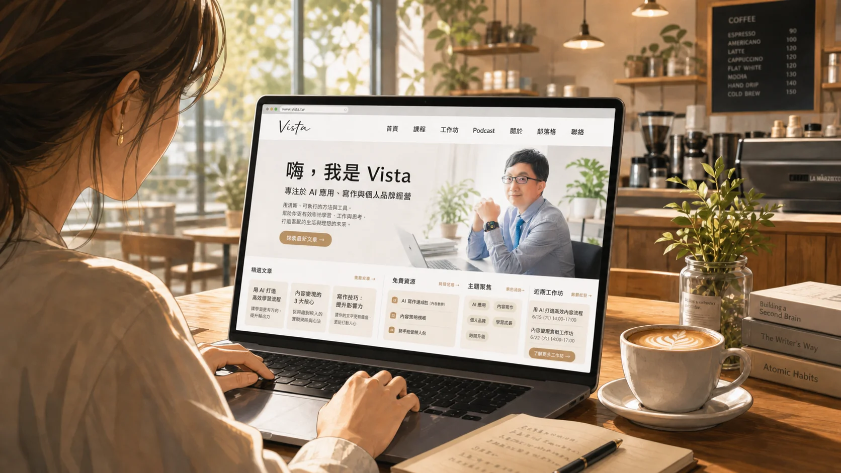
In the past few years, I have scattered my opinions and practices in several places: writing long articles well in vista.tw, and putting the materials and short thoughts I read every day in content.tw and vista.st, centralized corporate training and consulting services at vistacheng.com, and online courses and workshops at solo.tw. Each domain name is responsible for only one relationship. This is also an exercise in applying “remove clutter, reserve space, and establish a unique focus” to your own content structure.
8. Three reminders for creators
Finally, I would like to condense these three visual principles into three sentences and send them to all my friends who are producing content, newsletters, courses or building brands.
The first sentence: Look at the protagonist first, then the background.
Before any scene begins, ask who the protagonist is. As long as it has nothing to do with the protagonist, remove it first. The message will be clear if the screen is clean.
Second sentence: Blank space is not empty, it is a place for the eyes to rest.
If possible, don’t rush to fill every empty slot just yet. The reason is simple, because the space itself is the design. People who can leave blank space usually know how to control the rhythm better.
The third sentence: A picture only says one thing.
A photo can only have one protagonist, a poster can only have one main message, and a social picture card should have only one processor core focus. When you have too much to say, your audience is likely to turn a deaf ear.
Conclusion: A good picture saves the audience effort.
I often say that good content is not about showing how powerful the author is, but about saving effort for the reader.
The same goes for good vision.
A good picture does not need to make the audience guess randomly for a long time; it does not make the audience get lost in the picture; nor does it use a bunch of details to prove that it has a good sense of design.
A good picture lets the audience know where to look at a glance? Good pictures allow important information to emerge naturally. A good picture lets the protagonist be seen, lets the noise recede, and lets the space speak.
So, next time you want to take photos, make a presentation, design a card, or ask AI to generate pictures for you, you might as well not rush to pursue beauty.
Let’s ask three questions first:
- Who is the protagonist of this picture?
- Is the picture too messy? Is there a place for the eyes to rest?
- Is there only one focus?
As long as you think about these questions clearly, your visual works will start to look different.
Not because you suddenly become a designer, but because you begin to understand: the core of visual power is not decoration, but choice.
And truly high-end images often don’t involve doing too much. It’s you who finally know what things don’t need to appear.
Writing this article reminds me of my father, who passed away many years ago. Thank you for teaching me the way of seeing and showing me the beauty of photography.
Further reading:
- Build a personal website from scratch using Vibe Coding: Writers can also launch their own digital front on weekends
- The era of “empathy marketing” is coming: when brands become consumers’ AI personal consultants
- My Ulysses + AI writing workflow: Use a system to stably produce long articles
External resources:
- Vibe Coding Practical Workshop (solo.tw)
- Vista Consulting and Corporate Training Services (vistacheng.com)
- Vista’s Content Lab (content.tw)